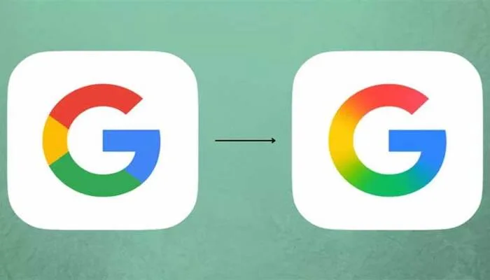
Google has unveiled the first update to its iconic “G” logo in ten years. The new design replaces the old blocky red, yellow, green, and blue colors with a subtle gradient. This change aligns the logo with Google’s Gemini AI branding for a fresher, modern look.
Where you can see the new logo
The updated logo now appears on the Google Search app for iOS and on Google Pixel phones running Android. However, it has yet to roll out on other Android devices and web browsers.
Mixed reactions from users
Reactions to the new logo have been mixed. Many users struggled to spot any difference between the old and new versions. Some joked the change was so minor it was like “taking off their glasses.” Others mocked the design process, questioning the resources spent on such a slight tweak.
Read: Indigenous Data Link Helps PAF Down Rafale Jets
Criticism and praise
Critics wondered how much money Google spent to add a gradient, while some found the new design less attractive than the classic, simpler logo. Comments ranged from “Are they messing with us?” to “The old logo is better.” On the other hand, some users praised the updated logo’s blurred and modern feel, saying it suits Google’s evolving brand identity.
Balancing change with familiarity
This update highlights the challenge global brands face when refreshing long-standing symbols. Balancing innovation with familiarity can stir strong opinions among loyal users.
Google plans to expand the gradient logo’s presence gradually, and the discussion around its effectiveness is sure to continue.
Follow us on Google News, Instagram, YouTube, Facebook,Whats App, and TikTok for latest updates
